The Label You See vs The Label You Feel
A label is often defined in visual terms. Colour. Layout. Logo. Typography. Clear information. All of these matter, but they do not tell the full story as while ideas and designs often move into production largely based on how they look, what matters most is how they make you feel.
Before a product is opened, handled properly, or experienced in use, the label has already started to work. It catches the eye, reflects light, creates texture, signals care, and delivers that all-important first impression. In many cases, it is the first physical connection between a brand and its customer, and it counts for a lot, especially in premium categories, where the decision to choose a product can be made in seconds. A label is a surface for delivering visual information, but humans have five senses, and great label design considers more than just one.
Multi-sensory experiences in label design
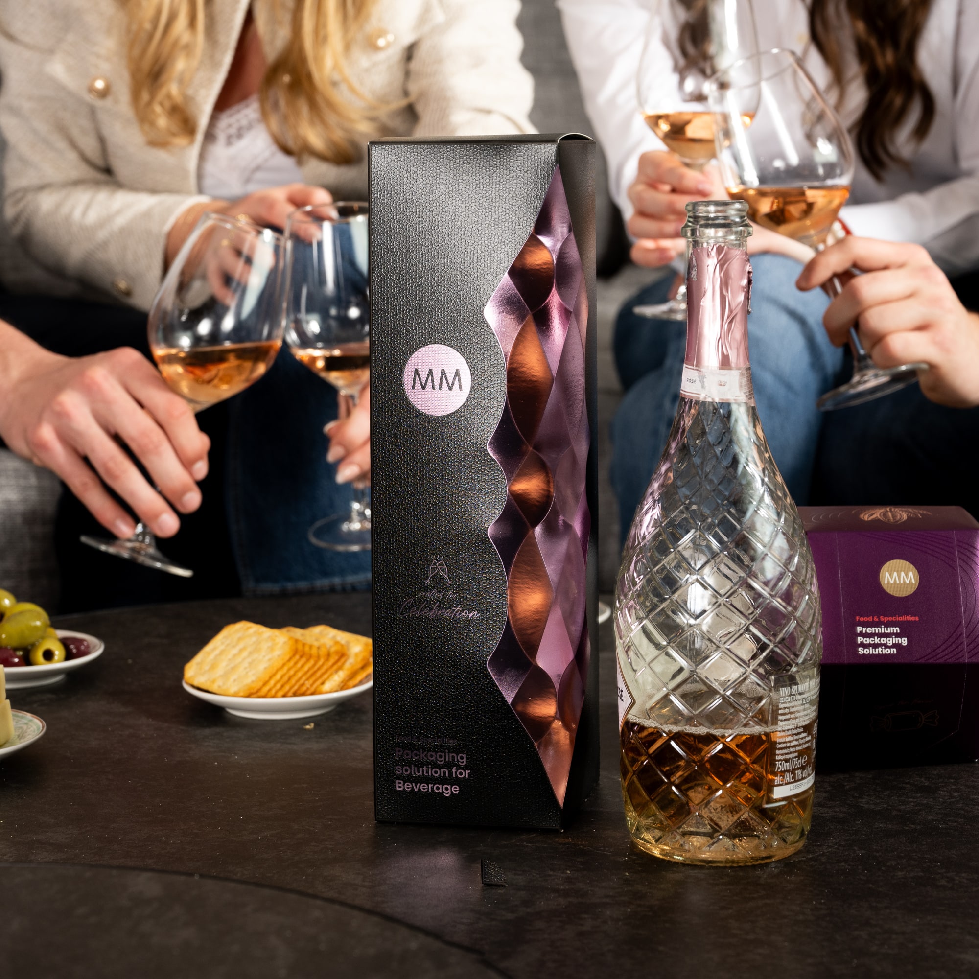
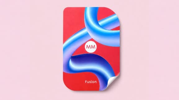
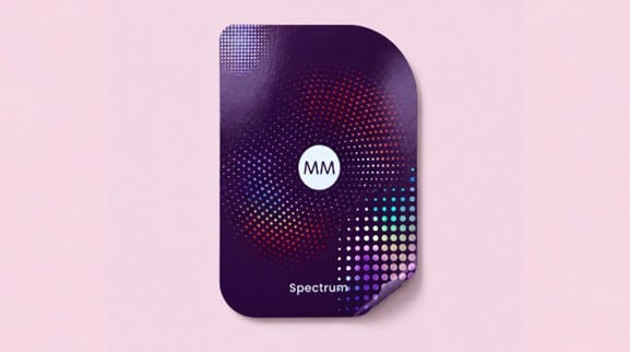
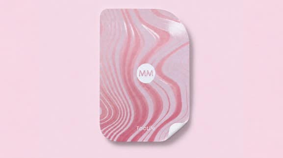
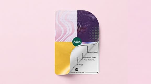
Texture can suggest craft. Embossing can create depth. Foiling can add light and a sense of movement. Varnishes can guide the eye or create contrast. Material choice can change how a product feels before and after the product has been touched, opened, or used. The addition of tactile and interactive elements opens up a whole world of sensory experiences, enabling brand storytelling through sight, sound, and touch.
These details may seem small in isolation, but on the shelf, they can carry significant weight. They influence how premium a product feels, how confidently it presents itself, and how clearly it communicates value.
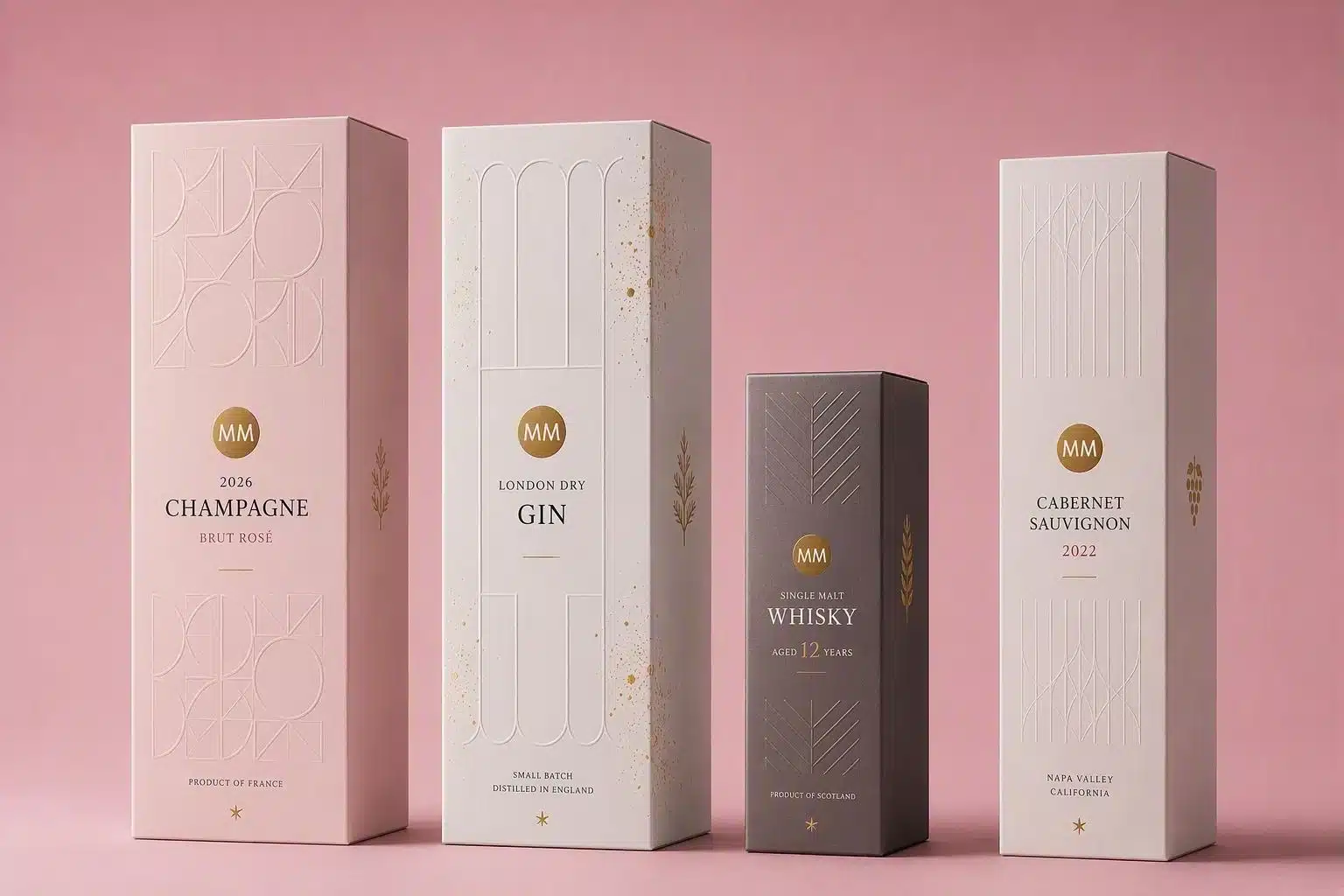
If a logo were removed, would the pack still feel considered? Would it still feel high quality? Would it still have presence? Would the consumer still have an idea about the product and brand? This is a useful way to evaluate label strength. Without a logo, the label should still communicate something about the brand’s position. It might feel natural, clinical, indulgent, crafted, contemporary, or premium, but it should feel like something. When material, colour, finish, and structure work together, the label becomes part of the brand language rather than a decorative add-on.
Answering these questions is the real test of label design. Strong labels do more than identify. They help build recognition, reassurance, and desire before consumers even become consciously aware that it is happening.
It’s never just a label. It’s never even just a blank canvas. It can be whatever you want it to be, and experts like MM Packaging can help you make that potential a reality.
Get in touch with our experts today to learn more about how our label portfolio can support your brand’s creativity through premium embellishments, durable materials, and functional innovations.
Frequently Asked Questions
Premium packaging depends on more than visual design. Consumers often judge quality before they use the product, based on cues such as texture, weight, finish, contrast, and material choice. A well-designed label can help communicate value instantly, making the product feel more considered and desirable from the first interaction.
As printing and finishing continue to evolve, packaging that looks great will become the standard. Packaging that feels great will be what differentiates products – and this is where label expertise can add real value.
This depends on the category and shopping environment, but colour, texture, and light reflection are all important. Colour can create immediate recognition. Texture can invite touch. Foil, gloss, and varnish effects can catch the eye from across the store through movement and contrast. The strongest labels often combine these elements, so the pack maximises its impact from multiple angles.
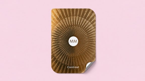
Finishing techniques add physical and visual depth, making a brand’s identity something that a consumer can literally feel. Embossing can make a label feel more crafted. Foiling can create a premium effect by playing with light and reflection. Spot varnishes can add contrast, highlight key design features, or create a more tactile surface. These small details add up to help the final product feel more intentional, which can strengthen perceived quality.
No. As referenced above, premium cues are now present across many categories, including food, beauty, personal care, pet care, confectionery, oils, beverages, and fragrance. In each case, the role of the label is to help the product stand out, communicate trust, and support the brand’s position. The finish may be subtle and minimalist or highly decorative and extravagant, depending on the product and audience. The possibilities are endless.
Touch helps make brand quality tangible. A consumer may not consciously analyse a textured surface or raised detail, but these features will still affect their perceptions of the product. A label that feels refined, precise, or distinctive can reinforce the impression that the product inside has been created with the same level of care, differentiating it from the competition and giving it a unique personality.
MM Packaging combines label production, finishing knowledge, material expertise and technical precision to help brands develop labels that perform visually, physically and commercially. Through World of Labels, MM Packaging is showing how labels can become a more strategic part of packaging design, from first impression to the final product experience.
It means the label should not be viewed as a commodity item or a final artwork step. It should be more than the sum of its parts; a flexible material featuring a finished printed design. It is a brand touchpoint, a sensory cue, and a high-performance detail that can be the difference between a product being left on the shelf and flying off it.